


Office Colour Ideas: How to Build a Calm, Focused Workspace
A grounded guide to choosing office colours using light, contrast, materials, brand context and employee preferences.

In this article
Colour changes how a workspace looks and can influence how people perceive it, but there is no universal shade that guarantees focus or creativity. Culture, personal preference, lighting, material and context all matter. A useful colour plan starts with the room and its users, not a rigid psychology chart.
Begin with fixed elements
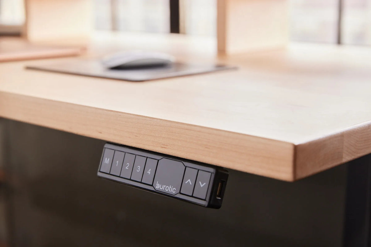
List the surfaces that will remain: flooring, windows, cabinetry, desktops and large equipment. Their undertones narrow the palette. A natural wood top, for example, already adds colour and texture. The Aspire Solid Wood Standing Desk can become a visual anchor rather than another element to match later.
Use a restrained base
Walls and large storage pieces are expensive to change, so a flexible neutral base often works well. Neutral does not have to mean stark white. Warm whites, soft greys and muted earth tones can support varied furniture and daylight conditions.
Add colour where it can change
Use artwork, planters, acoustic elements, storage boxes and textiles for stronger accents. These elements can be moved or replaced as the team and brand evolve. In a home office, one coloured wall can define the work zone without controlling the entire room.
Protect visual comfort
High contrast can aid wayfinding, but a very bright surface beside a dark screen may be tiring. Evaluate paint samples beside the actual monitor in morning and afternoon light. Matte finishes generally control reflections better than glossy ones in screen-heavy areas.
Coordinate rather than match
A workspace feels intentional when repeated undertones, materials or accent colours connect the elements. It does not need identical furniture. A metal filing cabinet can provide functional contrast, while a monitor stand can repeat the desktop material or introduce a quiet accent.
Include the people using the space
For shared offices, present a small number of coherent palettes and gather feedback. Ask about glare, brightness, wayfinding and the feeling of different zones. NRC research linking workplace design and mental wellbeing supports considering the broader environment, while colour remains only one component.
A simple palette method
- Photograph the room in daylight and electric light.
- Choose one flexible base colour.
- Identify one or two existing material tones.
- Add one controlled accent family.
- Test real samples before committing.
The best office palette is usable, coherent and easy to maintain. Let lighting, existing materials and user preferences lead, then add personality through elements that can evolve.

Previous article
Natural Light in the Office: Better Lighting Without Screen Glare
Next article
Small Office Ideas: Make More of a Compact Workspace