The Role of Color Psychology in Office Design
When it comes to designing an office space, color is an important factor to consider. The colors we surround ourselves with can have a subtle but powerful impact on our mood, behavior, and overall well-being. In this article, we'll explore the role of color psychology in office design and how to choose the right colors for your workspace.
The Psychology of Color
Color psychology is the study of how color affects human behavior and perception. Different colors can evoke different emotions and associations, and the right color palette can help create a desired atmosphere in a space. Here are a few examples of how different colors can affect us:
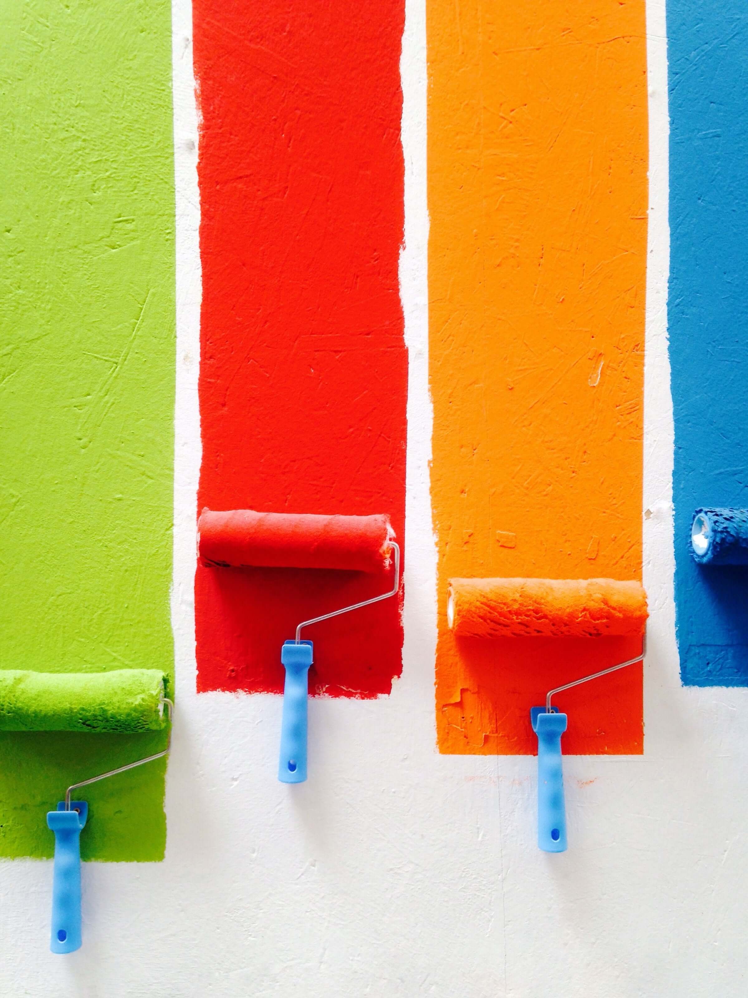
- Blue: Blue is often associated with calmness, trustworthiness, and reliability. It is a popular choice for office spaces because it can help create a sense of calm and clarity, which can be conducive to productivity.
- Green: Green is often associated with nature, growth, and tranquility. It can help create a sense of balance and harmony, and is often used in offices to promote a sense of calm and well-being.
- Yellow: Yellow is often associated with happiness, optimism, and creativity. It can help create a cheerful and energetic atmosphere, but it can also be overwhelming if used in large doses.
- Red: Red is often associated with passion, energy, and excitement. It can be used to create a sense of urgency or to draw attention, but it can also be overwhelming and stimulating if used too extensively.
- Purple: Purple is often associated with creativity, luxury, and sophistication. It can be used to create a sense of elegance and creativity, but it can also be perceived as aloof or distant if used in excess.
Choosing the Right Color Palette for Your Office
So, how do you choose the right color palette for your office? Here are a few tips:
- Consider your company's brand and culture: If your company has a specific brand color or color palette, it might make sense to incorporate those colors into your office design. This can help create a cohesive and consistent look and feel for your company. It's also important to consider the culture of your company and the atmosphere you want to create. Do you want a calm and serene space that promotes focus and productivity, or a more energetic and vibrant space that promotes creativity and collaboration?
- Consider the purpose of the space: Different areas of the office might serve different purposes and require different atmospheres. For example, a conference room might benefit from more energizing colors to promote collaboration and creativity, while a private office might benefit from calming colors to promote focus and concentration. It's important to consider the purpose of each space and choose a color palette that aligns with that purpose.
- Be mindful of the lighting: The lighting in a space can also affect the way colors are perceived. Bright, natural light can make colors appear more vibrant, while dim, artificial light can make colors appear duller. It's important to consider the lighting in a space when choosing a color palette, and to test out colors in the space before committing to them.
- Use color sparingly: While color can be a powerful tool in office design, it's important to use it sparingly. Too much of a good thing can be overwhelming and disruptive. A good rule of thumb is to choose a few key colors as accents and use a neutral palette for the majority of the space. This can help create a cohesive and balanced look without overwhelming the senses.
Incorporating Color into the Office
Once you've chosen your color palette, there are a few ways you can incorporate color into your office design:
- Paint: Painting is a simple and effective way to add color to a space. You can choose to paint an entire wall or just an accent wall, depending on the desired impact. Just be sure to test out paint swatches in the space before committing to a color, as the lighting and other factors can affect the way colors appear.
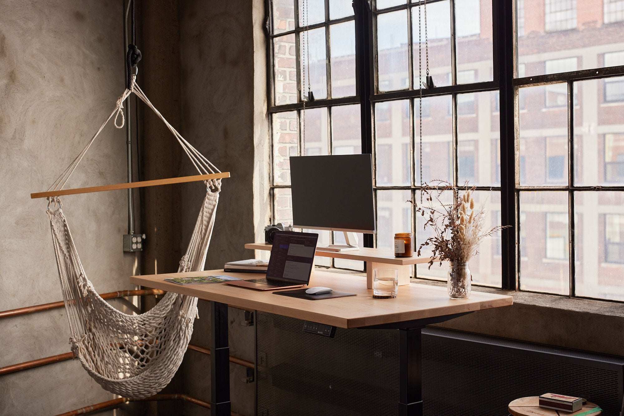
- Furnishings: Furnishings, such as chairs, desks, and curtains, are another way to add color to the office. Choose furnishings in your chosen color palette to add pops of color and create a cohesive look. You might also consider using neutral furnishings and adding color with throw pillows or other accessories.
- Artwork: Artwork is a great way to add color and personality to the office. Choose artwork in your chosen color palette to create a cohesive look, or mix and match for a more eclectic feel. Just be sure to choose artwork that is appropriate for the office setting and that aligns with your company's values and culture.
Conclusion
Color is a powerful tool in office design, and choosing the right color palette can have a significant impact on the atmosphere and overall well-being of the space. By considering your company's brand and culture, the purpose of the space, and the lighting, you can choose a color palette that aligns with your goals and creates the desired atmosphere. Just be sure to use color sparingly and incorporate it through paint, furnishings, and artwork to create a cohesive and balanced look.

Boost Productivity and Well-Being in the Workplace with These Natural Light Strategies
Maximize Your Small Office Space with These Simple Tips